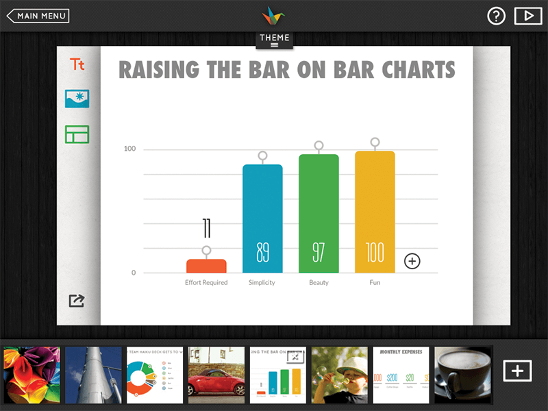
Just as some speakers use alternative presenting formats like Ignite and PechaKucha to improve certain parts of their craft, some also go beyond using tried-and-true presentation-design software like Microsoft’s PowerPoint or Apple’s Keynote to enhance their supporting visuals.
One such tool increasingly favored by many speakers is Haiku Deck, design software that helps bring new simplicity and discipline to slide creation, while also amplifying the emotional impact of messages. One guiding principle of Haiku Deck is “constraints lead to creativity,” illustrated by haiku poetry, which inspired the software’s name. That’s a theme also shared by PechaKucha and Ignite. Some presentation-design software operates on the belief that more is better, but Haiku Deck’s founders believe that less is more—fewer options, features and choices. A mobile-first approach to designing the software also means it’s easy to create slide content on tablets like the iPad.
“I’m a big fan of Haiku Deck,” says Michelle Mazur, a Seattle-based speech coach. “It forces you to use a format that doesn’t allow a lot of text, and you can search and use a treasure trove of quality images within the software. It’s also a good tool if you have to design a presentation quickly.”

Noted keynote speaker and author Scott Berkun also uses Haiku Deck. “I tend to be a skeptic when it comes to presentation-design software, but Haiku Deck is all about simplicity and it has a wealth of good, royalty-free images,” Berkun says. “It also helps you avoid some of the problems you can get into with other software, like being too text-heavy or focusing too much on transitions or animation at the expense of your message.”
Here are other tenets of Haiku Deck:
There should be only one idea per slide. To encourage this practice, the software deliberately limits the amount of text users can put on a slide. To those who believe the concept leads to creating too many slides, Haiku Deck’s creators respond this way on their website: “Trust us, it’s not the number of slides that matters. It’s how clearly those slides communicate your message.”
Use pictures to tell stories, not as decoration. Pictures connect with emotions and make ideas more memorable. Haiku Deck’s keyword search allows users to explore over 40 million free Creative Commons images, plus additional content from Getty Images.
Focus on the story. It’s easy for speakers to get consumed with things like text formatting, building transitions or refining animations when using design software. Haiku Deck believes it’s not those things that make a presentation memorable—it’s simply the narrative. The software is designed to help speakers keep a laser focus on crafting their message.
Dave Zielinski is a freelance writer in Minneapolis, Minnesota, and a frequent contributor to the Toastmaster magazine.


 Previous
 Previous Article